Why COVID-19 graphs on a log scale are a bad idea
There’s been a disturbing trend in the media when it comes to COVID-19 charts: nearly all agencies have been graphing pandemic statistics on a logarithmic scale.
If you’re a researcher, publisher, reporter, or science blogger whose job is to help the public make sense of pandemic data with graphs and other visual aids, please keep reading. I’ll try to make a case for the linear scale and explain why not using it is a bad idea when it comes to pandemic data.
The case for the log scale
One of the main reasons to use the log scale is when our data has a very large range, and the linear scale ends up compressing smaller values like a “zoom-out effect.” Avoiding this effect is critical if we are interested in analyzing change rates in a time series.
For example, suppose we wish to investigate the ups and downs of Tesla stock price (figure below). We would have a hard time observing the nuances of price fluctuation on a linear scale due to the spike in 2013. Notice how the price slanted up by one order of magnitude, crushing the previous section of the time series to the bottom of the graph (left). The log scale, on the other hand, visually preserved the stock price variations (right).
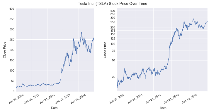
Figure 1: Tesla stock price on a linear scale (left) and log scale (right).
The log scale is also particularly useful in applications like absorbance charts, odds in statistics, spectroscopic graphs, and special scenarios in epidemiology.
The case against it
Did you notice that all the log scale use cases mentioned above come from STEM-specific areas? It may come up as a surprise to some, but not everyone has a degree in these fields, and those who aren’t will probably not understand logarithmic graphs. That should be enough reason for the word “logarithmic” never to appear in a piece whose role is to inform the public at large.
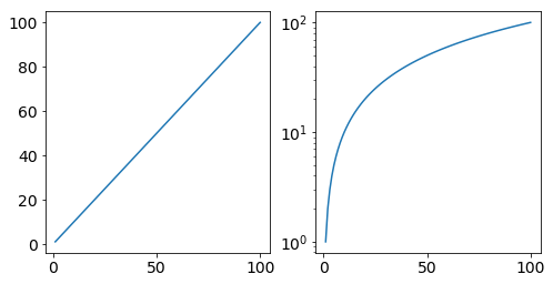
In fact, log graphs can deceive even STEM nerds like you and me. The confusion is perfectly understandable since even a monotonic straight line seems to “slow down” when shown on a log graph.
“But wait, the linear function isn’t a good analogy. Infection rates are exponential, and they would appear as straight crescent lines on a log scale.”
Ideally, yes, but the distribution curve of infected people in some countries is not perfectly Gaussian. Some sections of the curve will be subexponential due to several yet unknown factors.
Furthermore, there’s yet another thing that can surely make infection curves look like straight lines: the bottleneck caused by insufficient SARS-CoV-2 testing (I’m looking at you, Brazil). The example below use real numbers. It is the same data shown on a linear (left) and logarithmic (right) scale. Please take a look at it through the lens of someone who has no STEM degree for a moment.
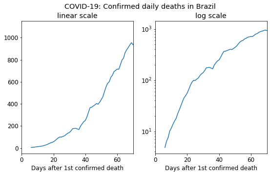
Figure 2: Source: Our World in Data
An incautious reader who glances over the graph on the right is prone to conclude that Brazil’s pandemic death rate is diminishing, while reality tells a whole different story.
Conclusion
According to CF Schmid and SE Schmid, charts should fulfill certain basic objectives:
“(1) accurate representations of the facts, (2) clear, easily read, and understood, and (3) so designed and constructed as to attract and hold attention.”
If a chart gives a false impression of reality at first glance and is poorly understood by a considerable fraction of the population, that should raise a lot of red flags. So why do most newspapers still insist on using the log scale in these cases?
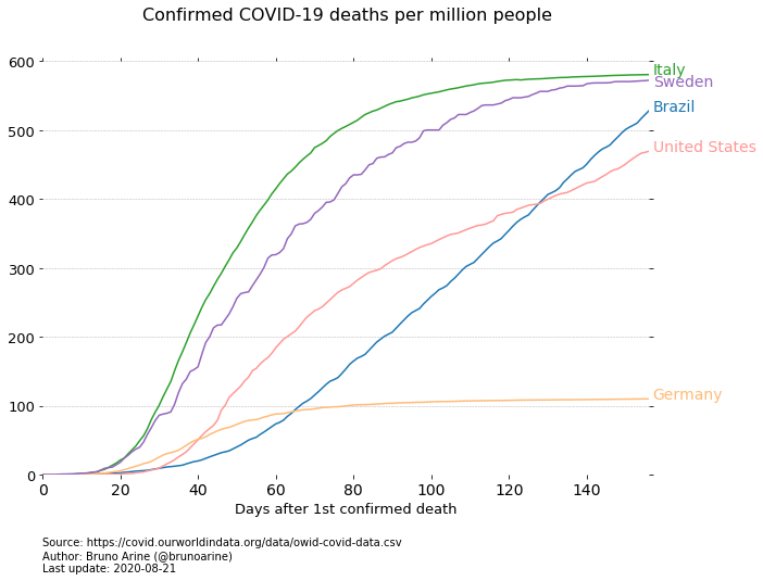
When data from differently sized countries started to hit the news, it became clear that the press spuriously adopted log scales to make multiple curves fit nicely in a single graph. But those responsible for informing the public should never make a chart look good at the expense of correct interpretation. There are better ways to garnish your article with broad-ranged data without distorting it: using multiple graphs, for instance, or comparing countries with similar realities, or—my preferred alternative—using relative numbers like “X per million people” (see below).
So please, make pandemic graphs on a linear scale, use masks, and stay safe.
References
Schmid CF, Schmid SE. Handbook of graphic presentation. New York: John Wiley & Sons, 1954.